Bankier.pl – visual identification, a website
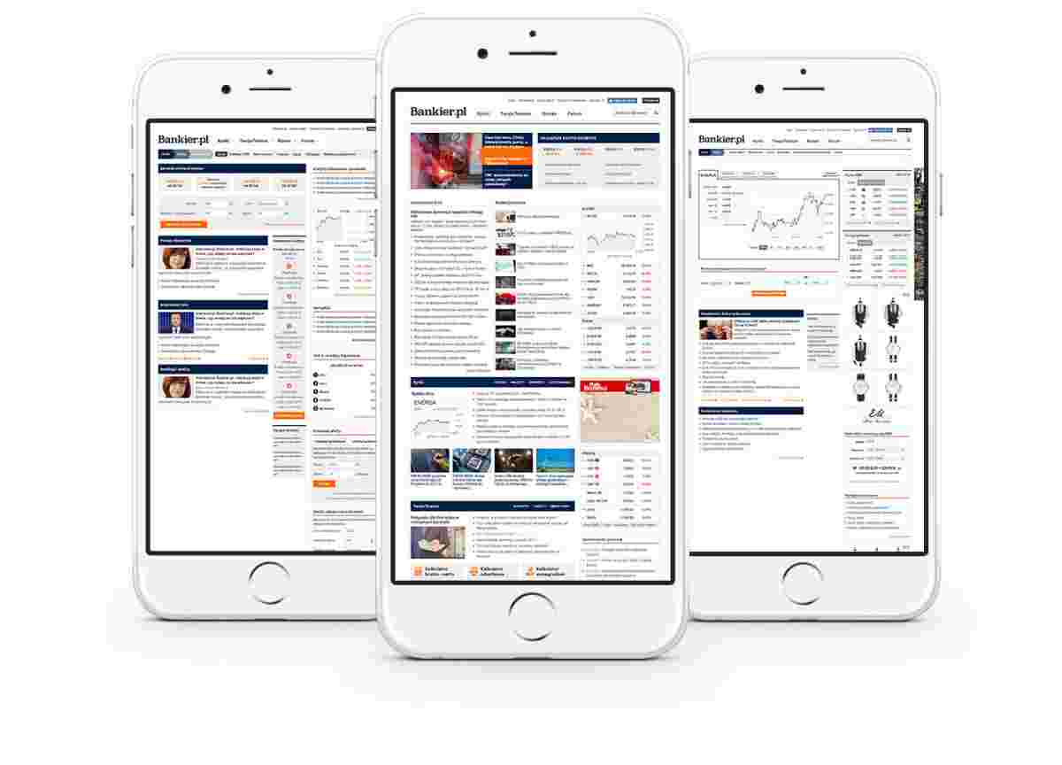
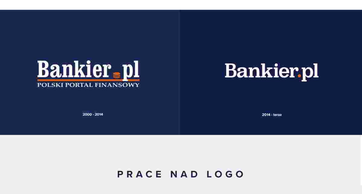
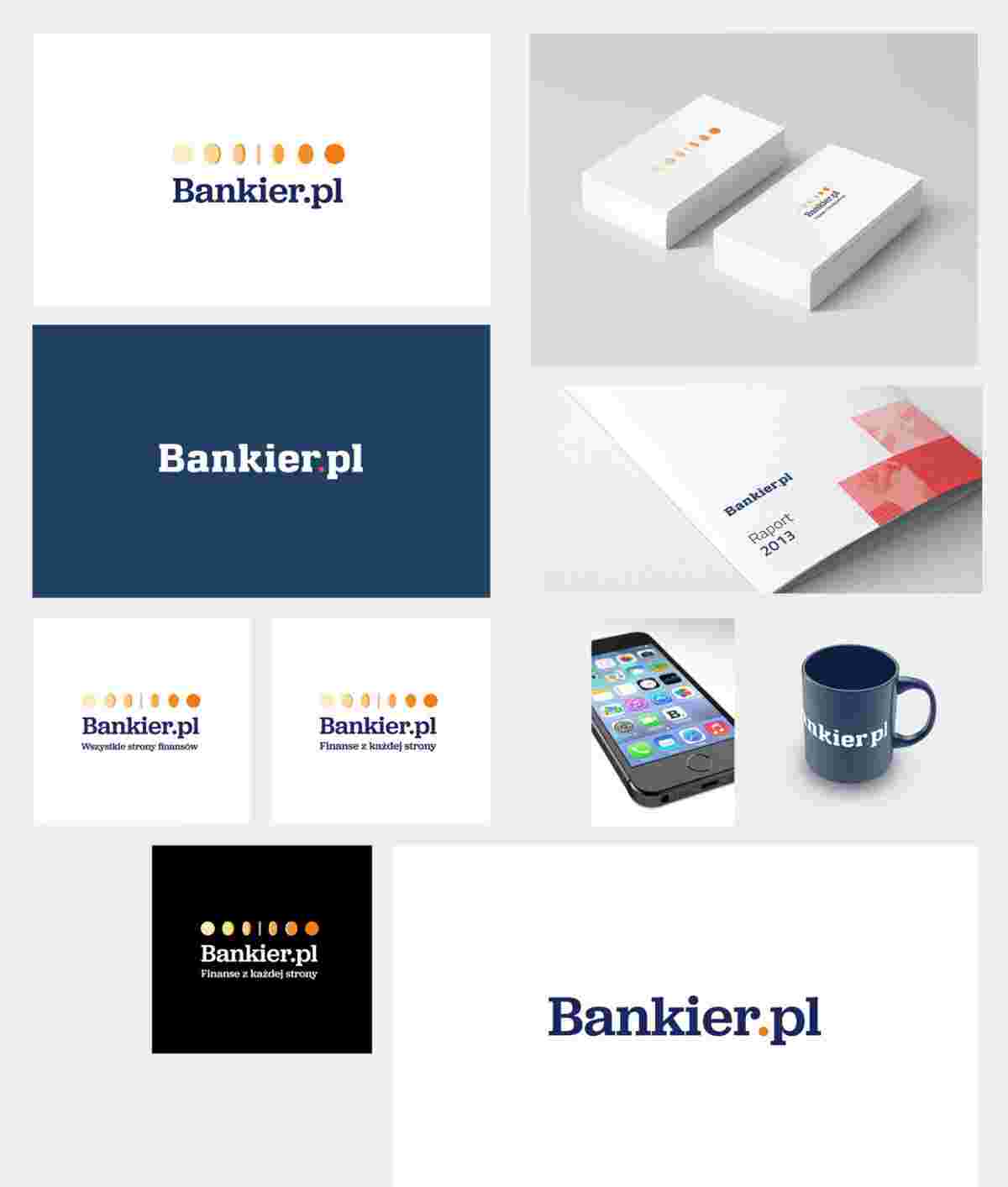
Our proposal to smarten up the Bankier.pl website was cutting-edge, transparent, and more functional, and therefore it was us who got to develop the website and new visual identity! The website's logo refers to the 14-years' worth of tradition and strength of the Bankier.pl brand, and the refreshed visual identification presents and highlights the evolution that the brand has undergone in recent years. We have rebuilt the website's navigation, which has been divided into three main sections: Markets, Business, and Your Finances. Distinguished on the main page are thematic sections, tools, and the Bankier.pl forum, which gathers the largest investor community in Poland. Change of the structure, appearance, and visual identification of the website were aimed at refreshing the brand's image while maintaining the existing expert-like character. Our aim was to, through the created elements (keywords), reflect those exact values which the founders of bankier.pl follow in their activities - credibility, expertise, and openness. Investor-dedicated tools are presented in an attractive form and enriched with new functionalities. Their display on the home page and subpages was increased and linked to the website's content. Page layout and a large selection of additional content, thematically related to the currently viewed website, encourage further website exploration. Fundamental changes within the new website encompass its technological aspect. The programming layer of Bankier.pl was developed practically from scratch. The entire application architecture has changed - both the database and the technology employed for developing the website.
See more

Spanish premium accessories for the little ones